Broad Money Payment
My role
UI/UX Designer
Product
broad-money-payment
duration
oct 2024 - Present

The Problem
The Previous Broad Money Payment app suffered from an outdated and inconsistent UI that weakened user trust. Complex onboarding and send-money flows caused high drop-offs, while incomplete modules broke user journeys. The dashboard couldn’t display multiple wallet cards, key balances were hidden, and there was no business web dashboard for bulk transactions. Overall, the product lacked scalability for new currencies and features like third-party payments.
The Goal
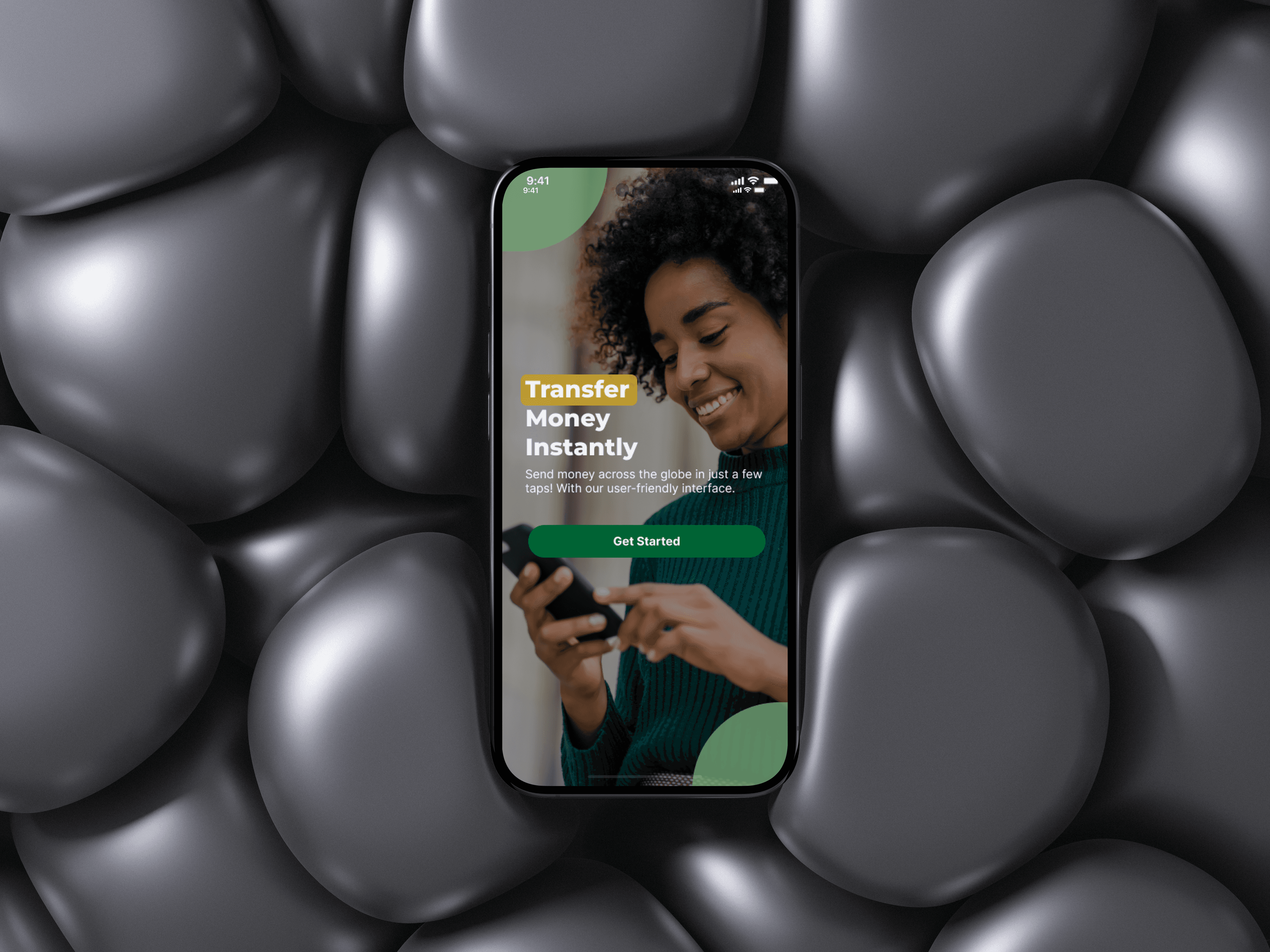
The redesign rebranded Broad Money Transfer as Broad Money Payment (BMP) with a modern, unified design system. Mobile and web dashboards were revamped for a seamless UK–Nigeria remittance experience, onboarding and Send Money flows were simplified, and the wallet dashboard was enhanced to display multiple cards with horizontal scrolling. The redesign delivered complete, accessible modules, consistent branding, and a scalable architecture for future currencies and business use cases.


Scroll to read
Secondary research
Reviewed top fintech apps, user reviews, and expert blogs.
Analyzed solutions, strengths, and weaknesses.
Identified key user pain points and unmet needs.
Findings compiled in a downloadable report here:
https://heyzine.com/flip-book/fa45b3410b.html
View Competitive analysis here

Painpoints
Cognitive overload: Complex onboarding lowered task completion.
Limited wallet visibility: Hard to view multiple balances.
Broken journeys: Inactive modules disrupted flows.
Outdated UI: Inconsistent design reduced trust.
Limited business use: No web dashboard for advanced transactions.
Accessibility issues: Poor spacing hurt readability.


Scroll to read
user persona
Name: Akinkunmi Motunrayo
Age: 26
Location: London, UK (originally from Nigeria)
Occupation: Cardiac Physiologist
Goals:
Send money UK → Nigeria quickly and reliably
Enjoy smooth onboarding
Access responsive support
Frustrations:
“Onboarding takes forever.”
“Transfers take days, stressing my family.”
“Support is slow or unhelpful.”
Quote:
"I just want a fast, simple, trustworthy way to send money home."

Design process
We started by uncovering user pain points through research, then iterated through ideation and prototyping to create an intuitive, efficient solution.

Scroll to read
mind map
Created a collaborative mind map in Miro to visualize user flows, pain points, and feature ideas.
Facilitated stakeholder and team workshops for ideation and alignment.
Prioritized concepts based on user needs, business goals, and technical feasibility.
Encouraged co-creation and iterative thinking across design and development teams.
Ensured the process supported user-centered design and informed the product roadmap.

paper wireframes
Started with low-fidelity paper sketches to quickly explore layout, flow, and key screens.
Focused on core user tasks and navigation paths before digital design.
Iterated rapidly based on initial feedback from stakeholders and team.
Used sketches to validate ideas early and identify potential UX issues.
Set the foundation for digital wireframing and interactive prototyping.

Scroll to read
low-fi protoype
Translated sketches into a low-fidelity Figma prototype.
Focused on layout, hierarchy, and core interactions.
Created clickable flows for quick iteration and feedback.
Validated user journeys and set foundation for high-fidelity design.

More low-Fi Prototype
+300 Screen low-fi wireframes

Initial Hi-Fi Prototype
Dashboard displayed only one wallet card, limiting visibility across multiple currencies (NGN, GBP, USD).
Send money flow lacked clear cues, making it hard to choose payment methods or recipients, reducing task completion.
Onboarding required full KYC before app use, creating a high barrier and causing early drop-offs.
Scroll to read
usability testing & findings
Conducted moderated A/B tests and internal usability sessions on the dashboard.
Found users needed quick access to multiple wallets and better balance overview.
Redesigned dashboard with a scrollable carousel showing all wallet cards.
Changes improved usability, visibility, and user satisfaction.

key discoveries
Conducted moderated A/B testing on the Send Money screen to improve flow and clarity.
Simplified steps with high-visibility input fields for sender/recipient.
Added transparent exchange rates and fees to build trust.
Improved task completion, first-time success, and user confidence, enhancing overall usability.

Scroll to read
key discoveries
Redesigned onboarding after identifying that the initial flow was lengthy, requiring full KYC, documents, personal details, and income info before accessing the dashboard.
Introduced choice between Simple Onboard and Full Onboard, with estimated completion times for each.
Allowed users to access the dashboard and key features immediately if choosing Simple Onboard.
Improved user autonomy, reduced drop-offs, and increased onboarding completion rates, enhancing overall first-time experience.

accessibility considerations
Implemented accessible UI components with buttons ≥44px for better interaction accuracy.
Ensured WCAG-compliant color contrast (AA/AAA) while maintaining brand consistency.
Added high-contrast toggle and screen reader support for key elements.
Results: task success ↑82%→95%, errors ↓30%, time on task ↓15%, satisfaction ↑78→90, achieving 100% WCAG AA compliance.

Impact
Project Impact
Onboarding drop-offs reduced by 35% with simplified KYC and clearer flows.
Transaction completion speed improved by 40%, enhancing cross-border efficiency.
Daily active users increased by 25% post-redesign.
User satisfaction rose by 30% per internal usability feedback.
Reinforced BMP as a fast, secure, and intuitive global money transfer platform.

01
Reflections
Limited testing, tight timelines, and backend limits constrained BMP web and mobile validation and UI flexibility.
02
Lessons
These challenges highlighted the need for early user validation, close developer collaboration, and feature prioritization under constraints.
03
Next Steps
Moving forward, I’ll use continuous testing, sync with developers early, and push for flexible, research-driven design timelines
What I bring to the table
Digital experiences that engage users and help your startup stand out from day one