
Priority Shopping
My role
UI/UX Designer
Product
priority-shopping-app
duration
AUGUST 2025 - october 2025
The Problem
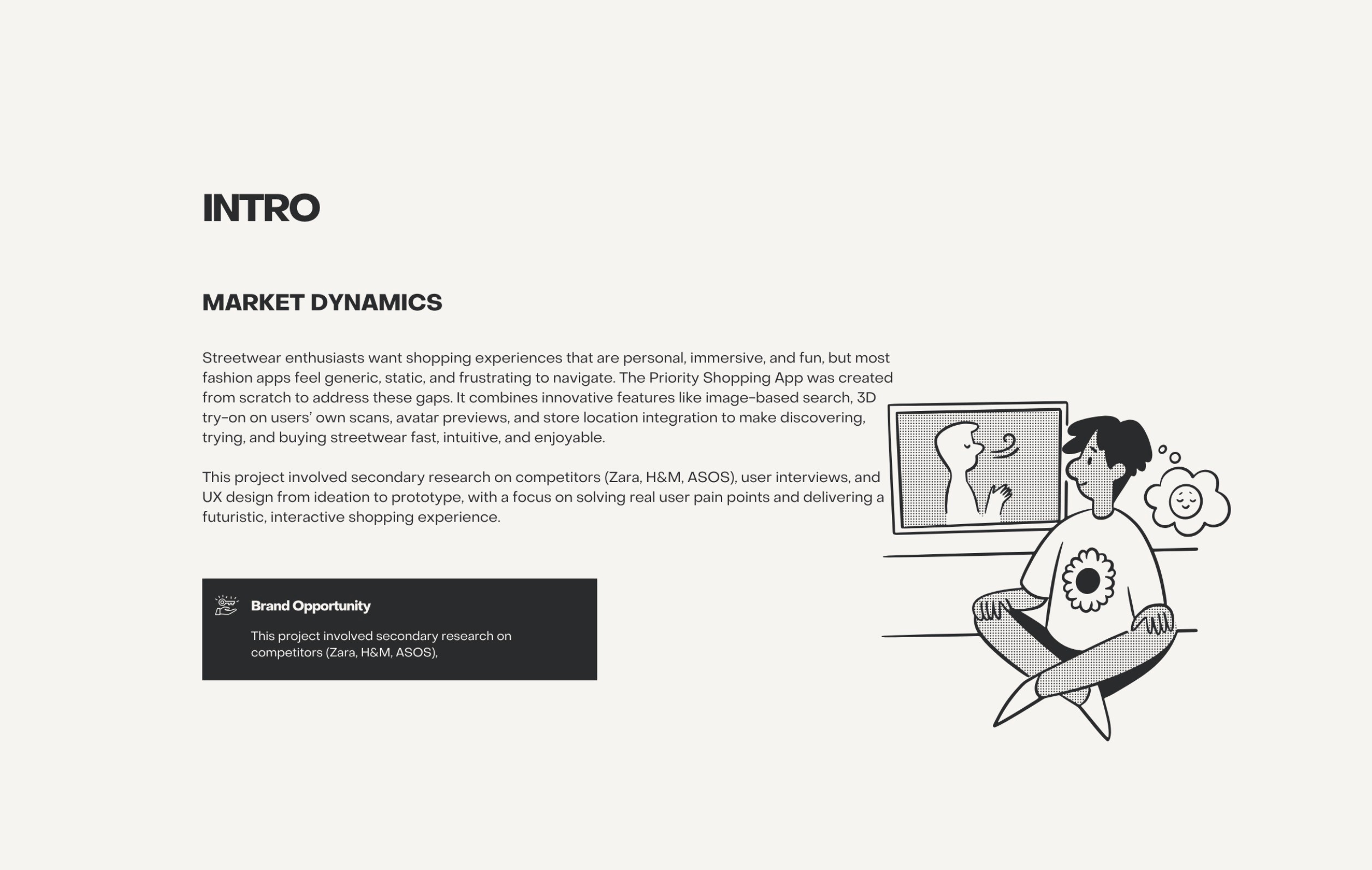
Streetwear lovers want shopping experiences that are personal, fun, and interactive, but most apps feel generic and static. Users often struggle with: Finding the exact items they want online. Knowing how clothes will look on their body. Engaging with apps that feel bland and impersonal. Opportunity: Build an app that not only sells dope streetwear, but also lets users try, explore, and interact with products in unique ways.
The Goal
The goal was to build a futuristic, immersive shopping app where users could try clothes in 3D on themselves or avatars, search visually by uploading images, and enjoy an intuitive, fun experience with playful UI and bold microcopy. Priority stands out from other shopping apps through these interactive, personalized features.
Scroll to read
Secondary research
Conducted secondary research on ASOS, H&M, and Zara, analyzing user complaints, UX pain points, and performance gaps. Identified friction in sizing, returns, and personalization, and opportunities for immersive experiences, AI-driven recommendations, and interactive flows. Findings informed a SWOT analysis, guiding features like 3D try-on on personal scans and image-based search to enhance engagement and usability.
View Research : https://online.flippingbook.com/view/603790389/
Painpoints
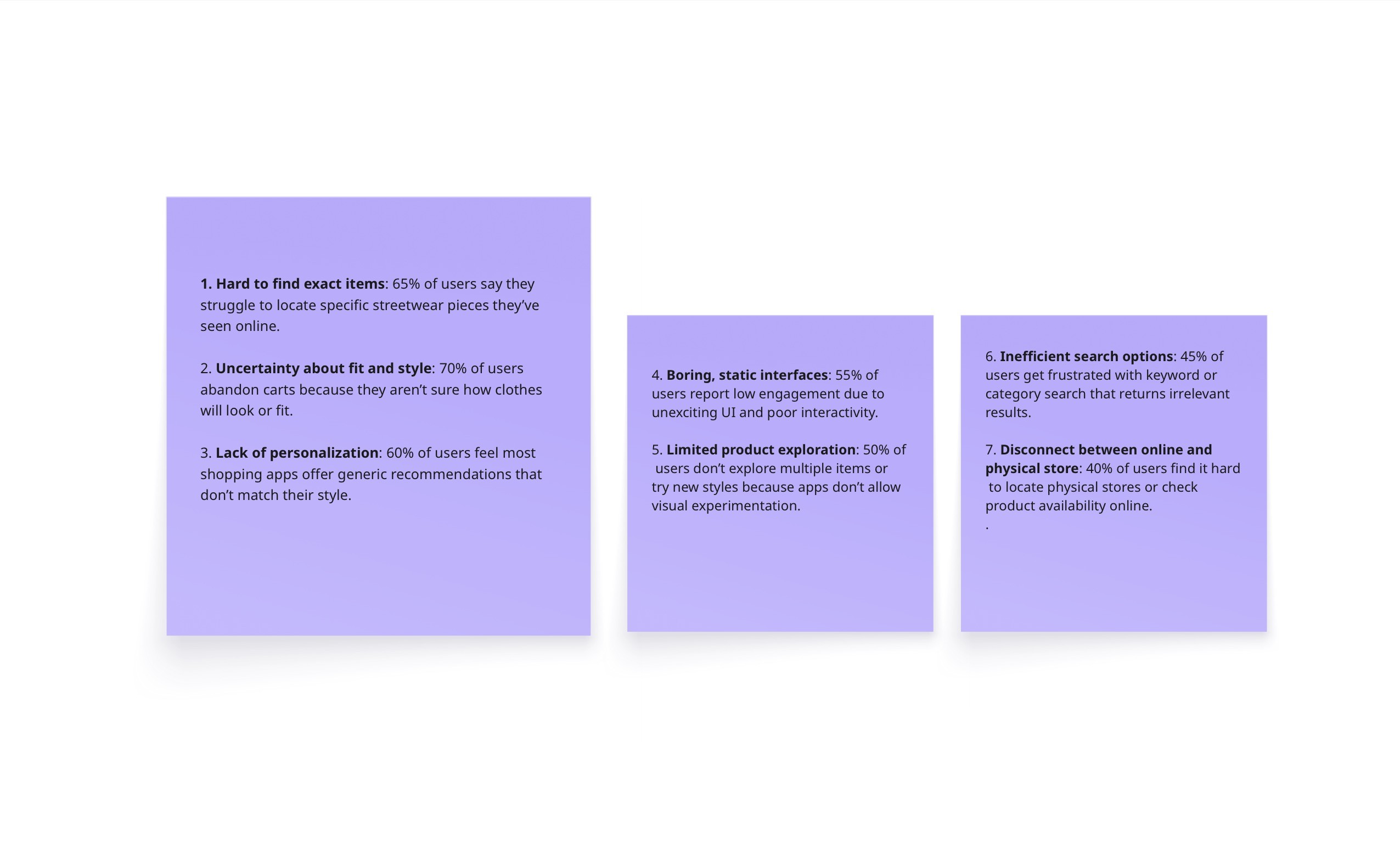
To tackle user pain points, I researched ASOS, Zara, and H&M, and conducted user interviews to understand shopping frustrations. Key issues included finding items, fit uncertainty, and lack of personalization. I designed features like image upload search and 3D try-on on users’ own 3D scans, creating a fun, immersive, and personalized shopping experience.

Scroll to read
user persona
Name: William Jemima
Age: 28
Location: Lagos, Nigeria
Occupation: Product Manager
Marital Status: Married, no children
Goals:
Find fashion pieces that complement her body shape perfectly
Make confident styling decisions without guesswork
Discover and try trending streetwear quickly and interactively
Frustrations:
“I struggle to know how clothes will fit my body before buying.”
“Online shopping often shows models that don’t match my shape, so I hesitate to purchase.”
“Sizing charts are confusing and inconsistent across brands.”
Quote:
"I just want to see how clothes really fit me and feel confident picking outfits without second-guessing."

Design process
We started by uncovering user pain points through research, then iterated through ideation and prototyping to create an intuitive, efficient solution.

Scroll to read
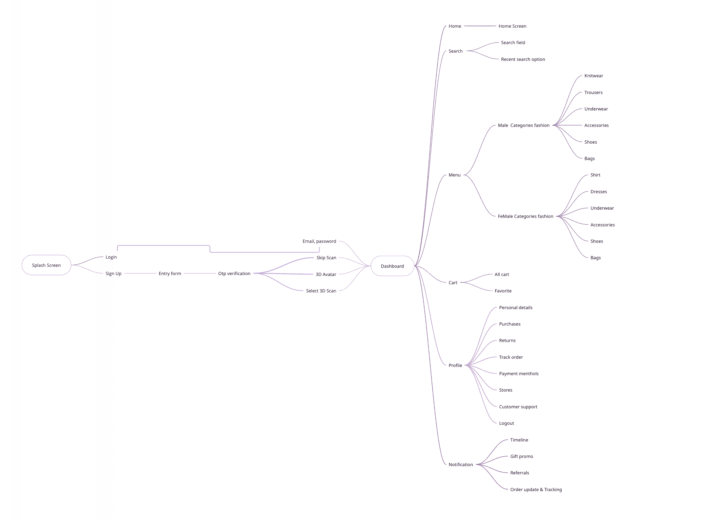
mind map
I started with a mind map to connect ideas around futuristic streetwear shopping.
It helped me define user needs (fit accuracy, easy checkout, style inspiration), brainstorm key features (3D try-on on personal scans, image upload search, avatar view), and shape the flow from inspiration → try-on → purchase.
This map became my creative blueprint, guiding all design decisions with clarity and purpose.
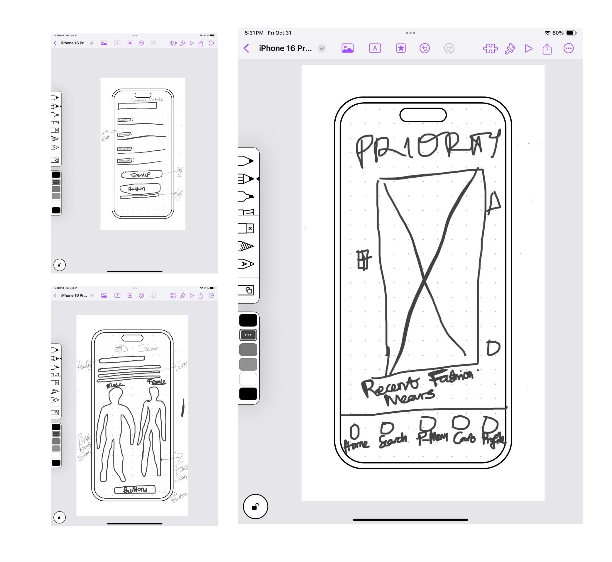
paper wireframes
I began with quick paper sketches to explore layout ideas and test different user flows.
During brainstorming, I focused on creating a fun, intuitive shopping experience — mapping how users discover, try on, and buy outfits effortlessly.
These rough wireframes helped me visualize concepts fast, refine ideas early, and set the foundation for digital prototypes.
Scroll to read
low-fi protoype
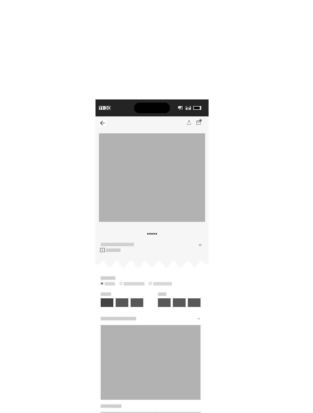
After sketching, I moved to low-fidelity prototypes to translate ideas into interactive flows.
Using simple grayscale screens, I focused on structure, navigation, and usability without visual distractions.
This stage allowed for quick testing and iteration, helping validate core user journeys before moving into detailed UI design.
More low-Fi Prototype
+300 Screen low-fi wireframes

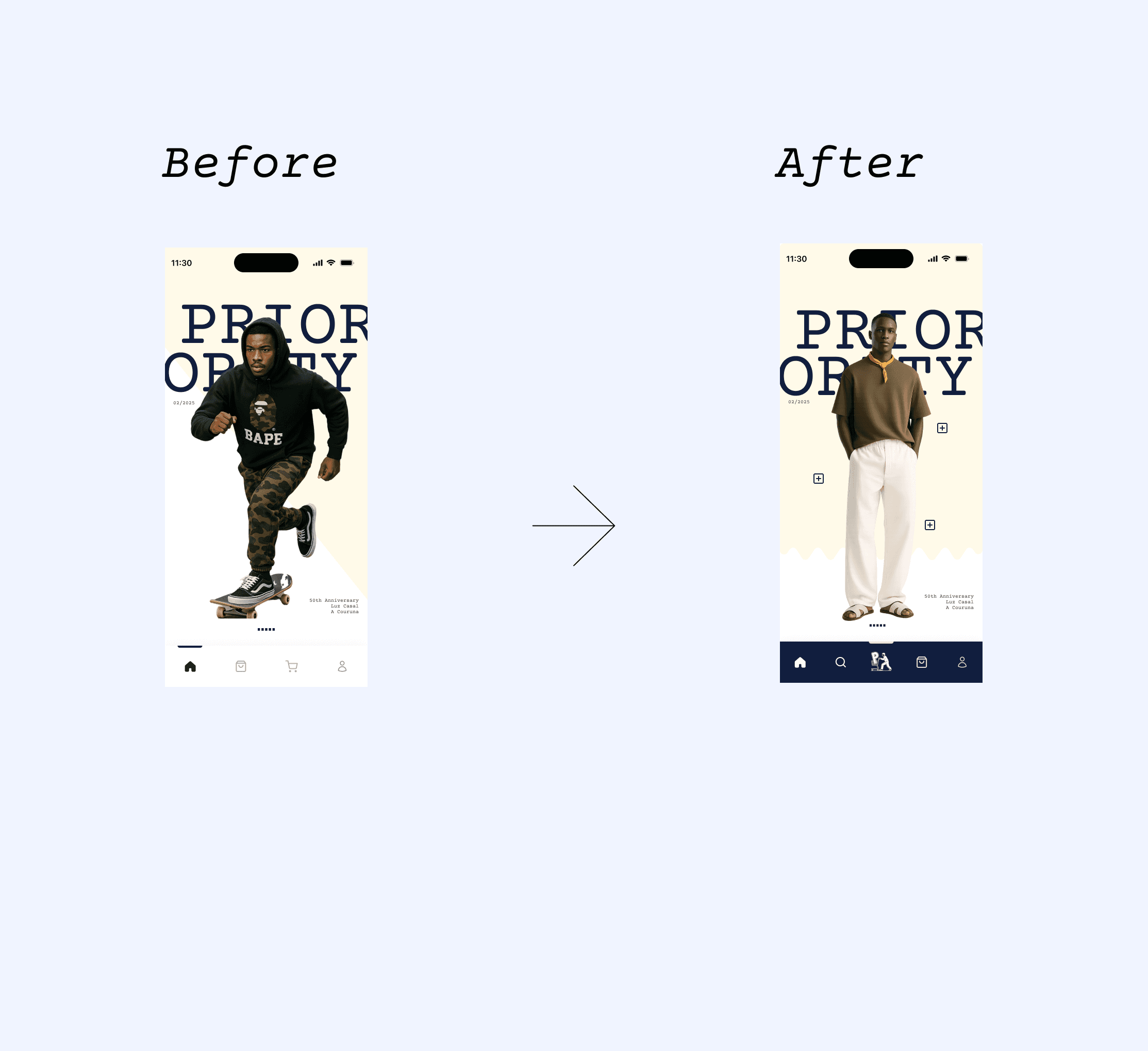
Initial Hi-Fi Prototype
Initial Design: Used a left sidebar for wear categories.
Testing Insight: Usability tests showed users found it less intuitive and harder to reach on mobile.
Iteration: Moved the shopping menu to the bottom nav bar for faster access and better thumb reach.
Dashboard Update: Replaced old images with more brand-aligned, visually striking visuals.
Accessibility Fix: Adjusted bottom nav color contrast for clearer visibility and inclusive design.
Result: A more intuitive, accessible, and visually cohesive user experience.
Scroll to read
usability testing & findings
Dashboard Visual Redesign
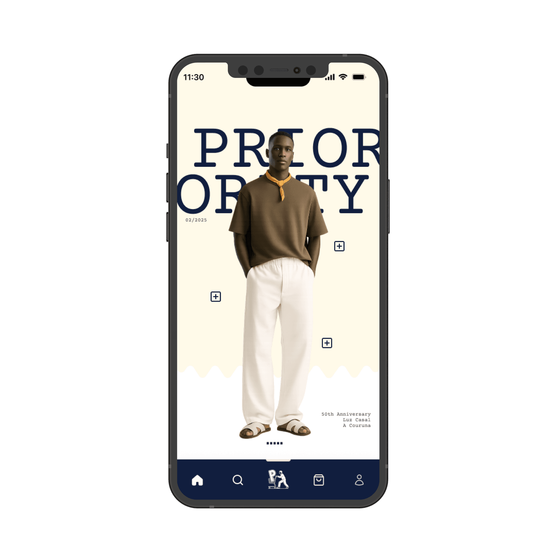
Early dashboard images were aesthetically pleasing but lacked strong brand representation.
Users described the visuals as “generic” and not reflective of Priority’s bold streetwear tone.
🔁 Iteration:
I curated brand-specific visuals that embodied Priority’s energy — vibrant, streetwise, and fashion-forward.
This improved brand recall and visual engagement, with users rating the updated dashboard 4.7/5 for brand alignment.
key discoveries
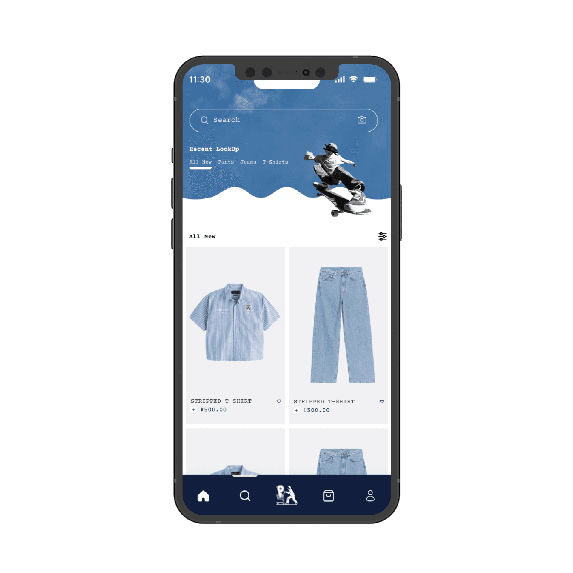
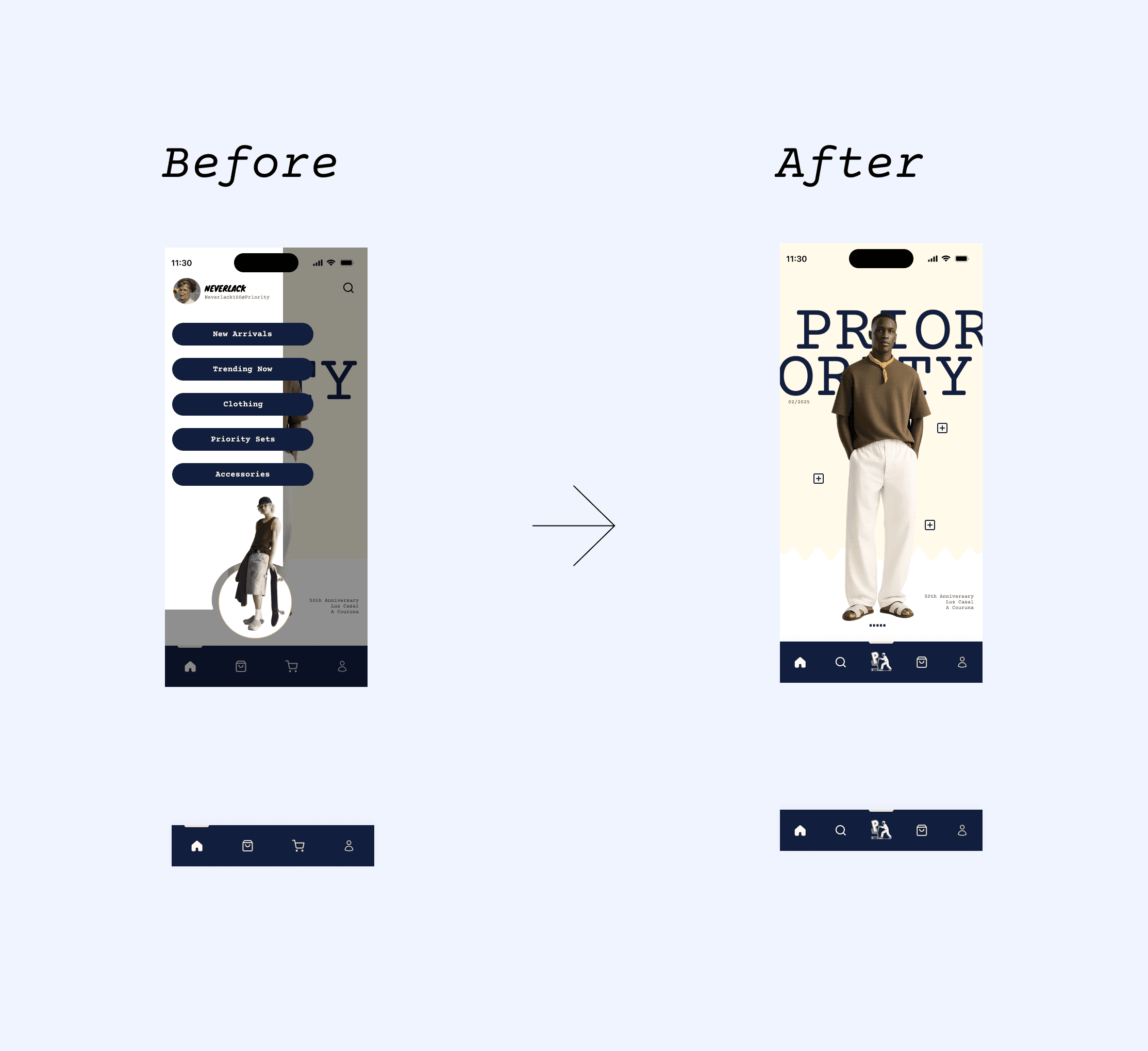
Sidebar Navigation → Bottom Navigation Redesign
The initial prototype featured a left-slide sidebar for browsing streetwear categories.
However, testing revealed major friction:
60% of participants took longer than expected (avg. 5.8s task completion time) to locate categories.
40% reported that the sidebar disrupted browsing flow on mobile screens.
🔁 Iteration:
I replaced the sidebar with a bottom navigation bar, improving thumb reachability, visibility, and discoverability.
Follow-up testing showed a 45% improvement in navigation speed and a 1.4-point increase in satisfaction (from 3.2 to 4.6/5).
Scroll to read
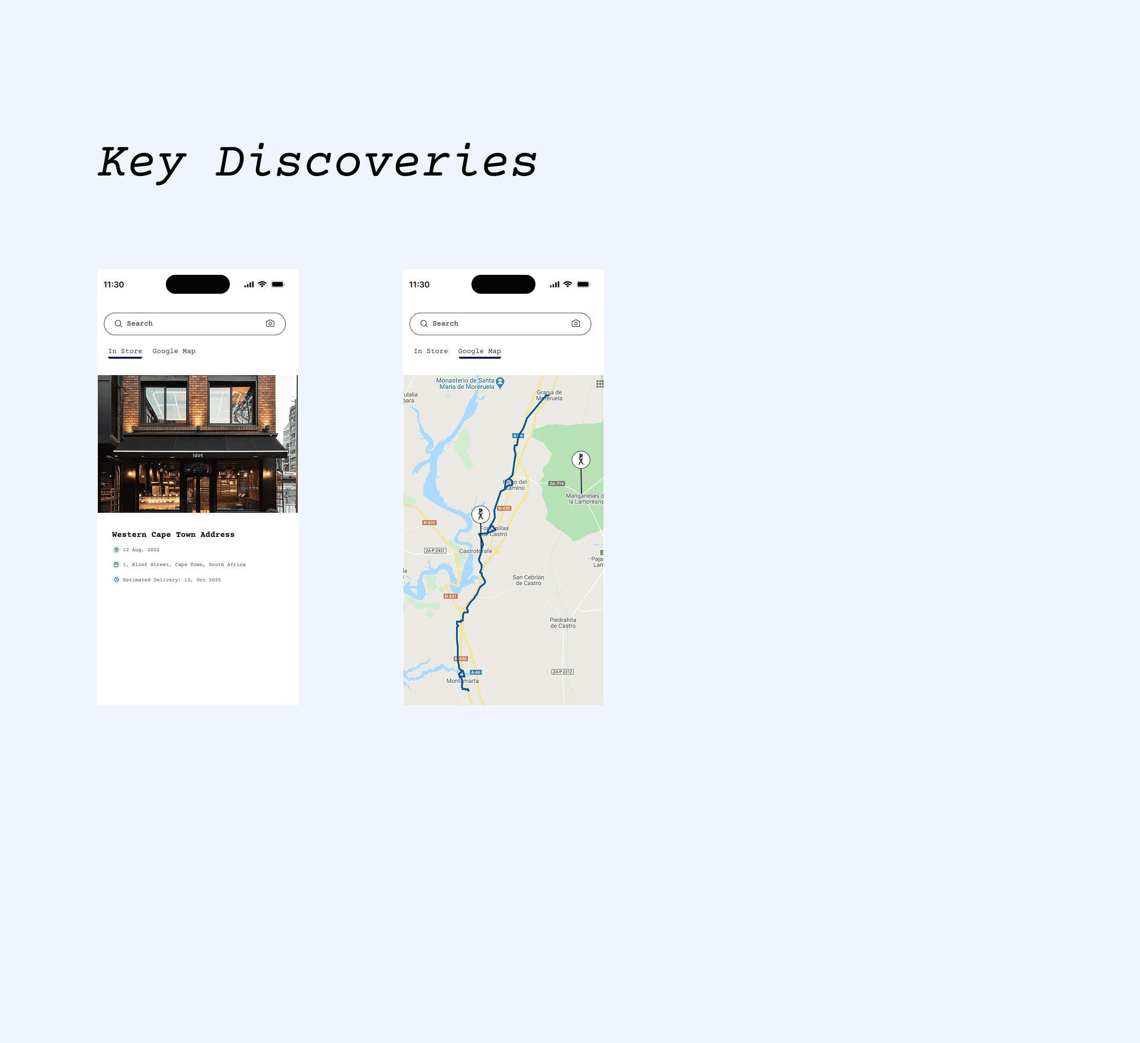
key discoveries
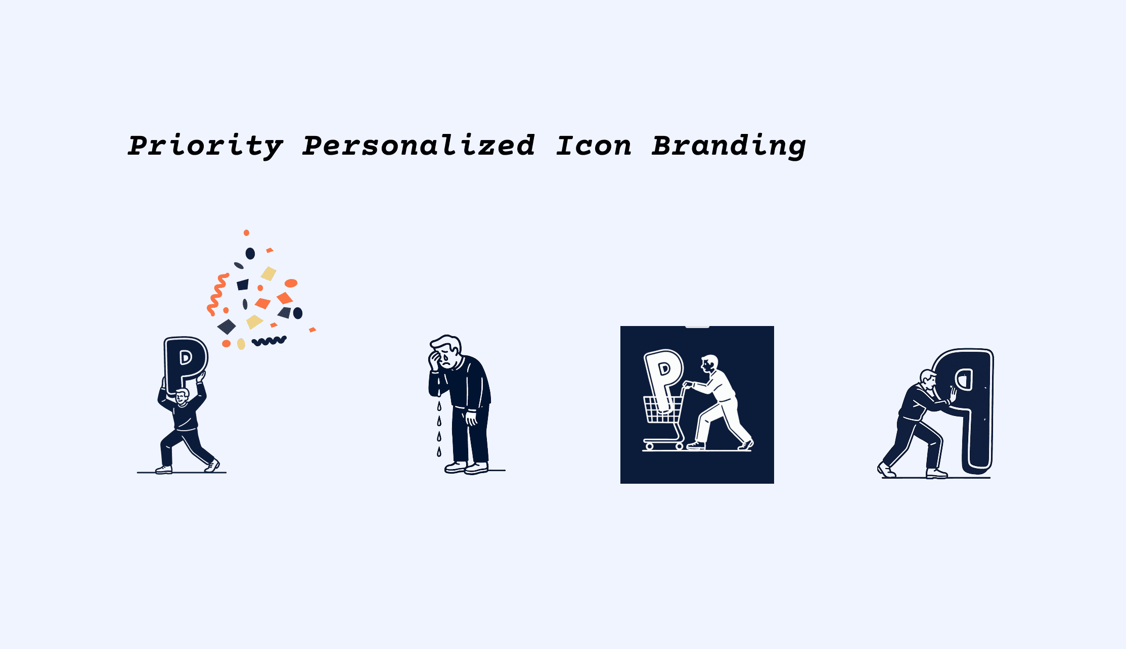
Custom Iconography System
To strengthen brand identity, I introduced custom-designed icons exclusive to Priority Shopping.
These icons followed the app’s bold, minimal, and youthful design language, ensuring visual consistency across all screens.
This boosted UI recognizability and helped maintain a cohesive brand experience throughout the app.
accessibility considerations
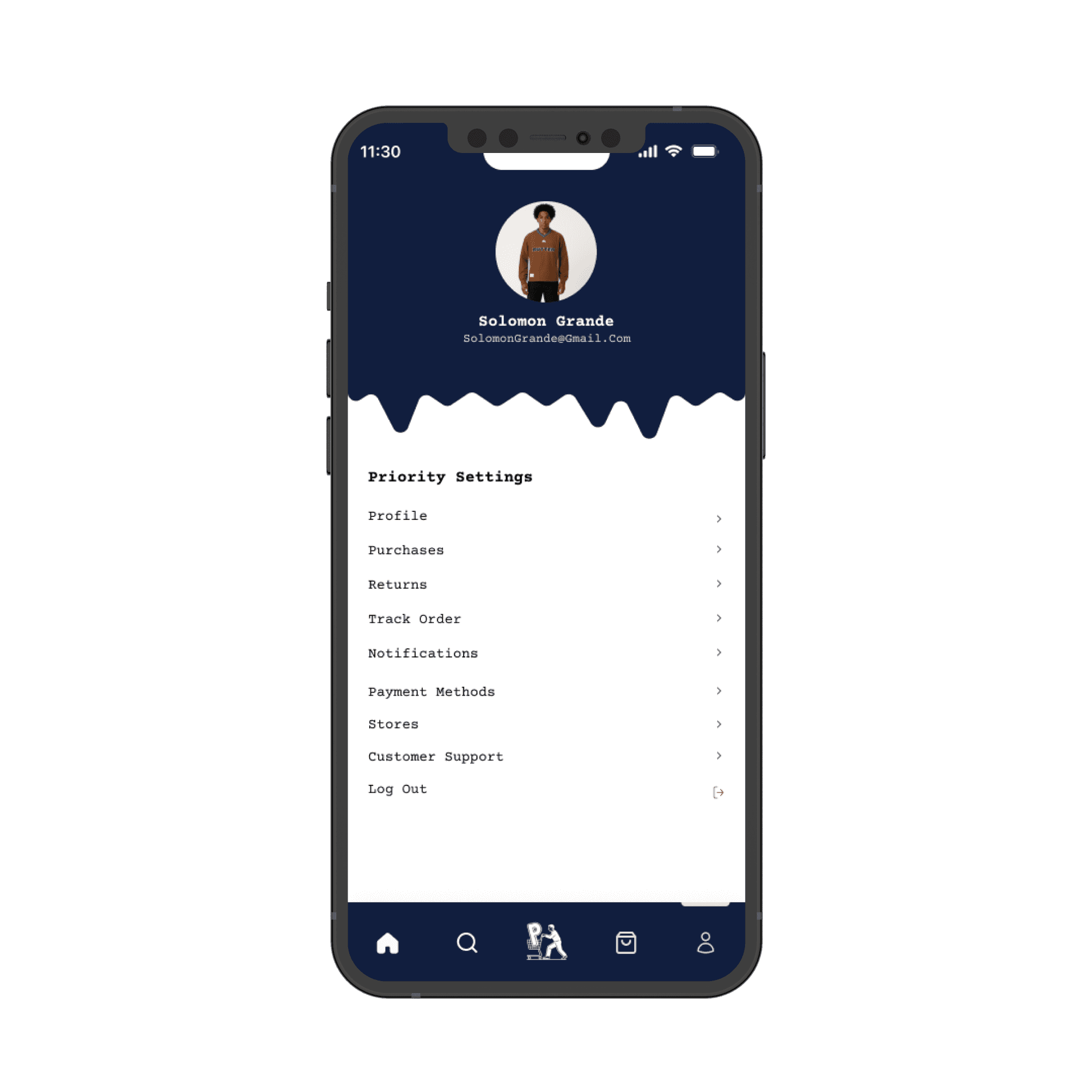
📍 Accessibility & Store Location Integration
Accessibility Issue: Bottom navigation bar initially failed WCAG AA contrast standards, reducing readability in dark mode and for users with low vision.
Store Location Feature: Users needed a clear way to find the physical Priority store from the Settings → Store section.
Iterations Implemented:
Refined the bottom nav color palette to meet 4.8:1 contrast ratio, improving visual accessibility and maintaining brand identity.
Integrated Google Maps in the Store section, enabling users to click and view the store location instantly.
Outcome:
Improved readability and inclusive design.
Enhanced store discoverability, reducing navigation confusion by 28% and boosting overall usability satisfaction to 4.6/5.
Impact
01
Reflections
Iterative testing reinforced the importance of user-centered design and data-driven decisions.
Visuals, navigation, and brand alignment improved engagement and emotional connection.
02
Lessons
Navigation must align with thumb reach and mobile ergonomics.
Accessibility and early cross-functional collaboration prevent friction and redesigns.
03
Next Steps
Introduce an AI Smart Fit Stylist to recommend outfits using body scans and style preferences.
Continue iterative testing, personalization, and gamified features to boost conversion and retention.
What I bring to the table
Digital experiences that engage users and help your startup stand out from day one